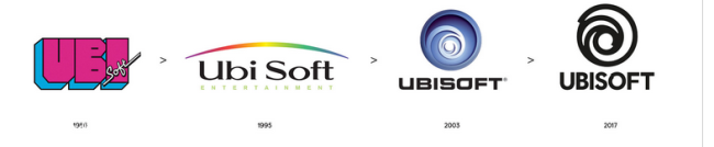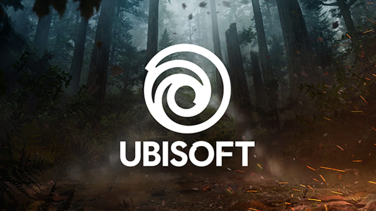
For the third time in 30 years, French gaming giant Ubisoft has changed its logo, although this time it's a way less drastic change than it's been in the past. As you can see below, the new logo is simple and understated while maintaining the same feel as the old one.
On the company's official blog Ubisoft had this to say about the change: "Today, we create worlds - worlds that live as video games, comics, movies, TV shows, books, and amusement park rides. Our new logo is minimalist, modern and monochromatic. It's a window into our worlds, giving a preview of what's to come by highlighting the artistry that goes into creating them. The swirl and the letter O are both deliberately created to be reminiscent of hand-drawn shapes and represent our human qualities of enthusiasm, curiosity and the grain de folie that Ubisoft is known for. With this new look, we proudly embrace our role as a creator of worlds and invite you, the players, to continue playing, engaging, and growing with us. As we move towards our most exciting time of the year (E3!), you will see this new emblem take on the colours and textures of our worlds, and we can't wait to hear what you all think."
Do you think the change is a good one?